Scrab offers four chart scales to optimize data visualization, and it’s essential to choose the right one based on your data type:
- Linear Scale (lin): This common scale shows changes in uniform increments and is ideal for percentage-based data like growth rates or margins. It portrays equal data changes consistently across the chart.
- Logarithmic Scale (log): This scale is best for data that shows exponential growth, such as stock prices or revenue, as it represents percentage changes, making it easier to visualize proportional growth over time.
- Percentage Scale (%): This is useful for comparing different metrics or companies on an equal footing. It helps analyze which company or metric has grown faster by normalizing different scales.
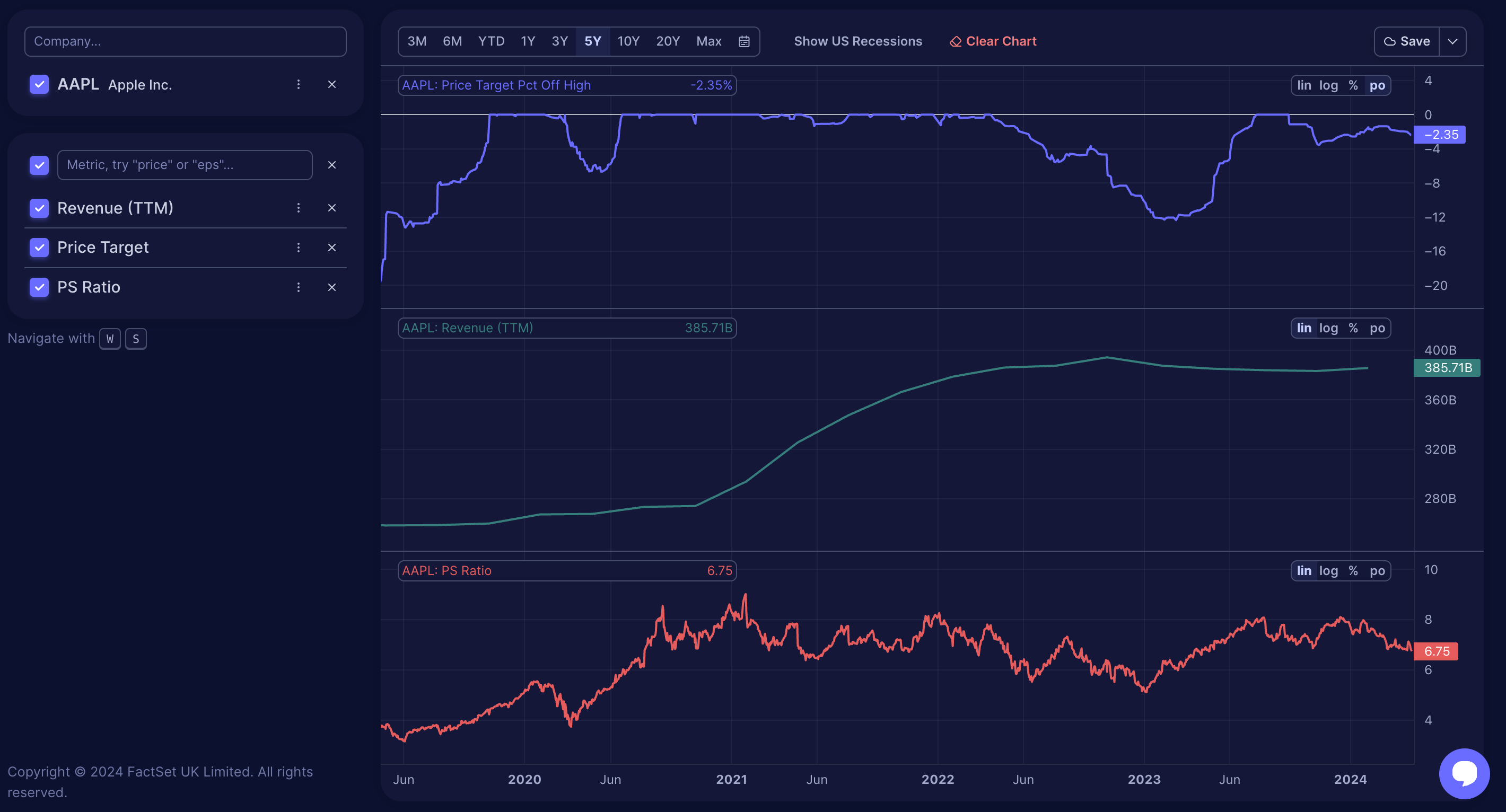
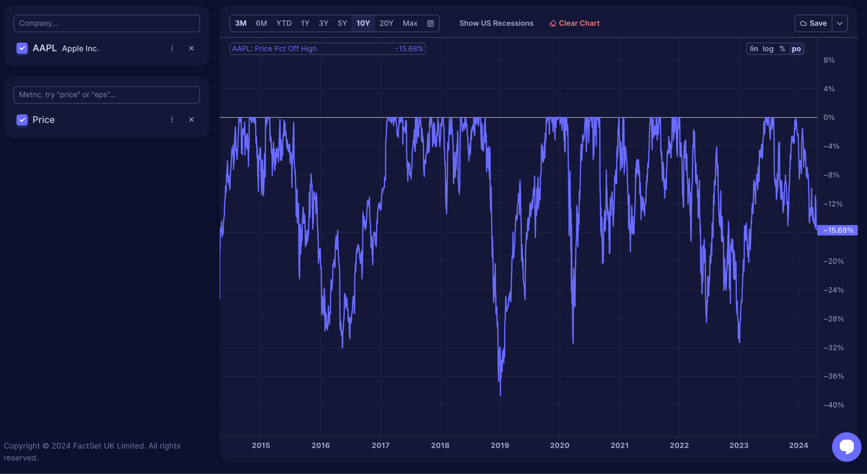
- Percent off High Scale (PO): This shows how much a metric, like a stock price, has dropped from its peak, which is useful in assessing the severity of a drop during market corrections.
You can manually switch scales depending on what aspect of the data you are examining to get different perspectives or more detailed insights.
Practical Application of Chart Scales
Linear Scale (lin)
Examining Apple's stock price since its IPO in December 1980 reveals a misleading trend. The linear scale used in most charts shows each dollar increase equally, regardless of the stock's actual price. For example, a $1 increase when the stock was at $0.16 represented a massive 600% gain, but the same $1 rise at a price of $142 (as of 01/02/2023) is less than a 1% increase. This uniform treatment can make significant early gains appear insignificant, causing confusion and making the stock's growth seem concentrated only in recent years.
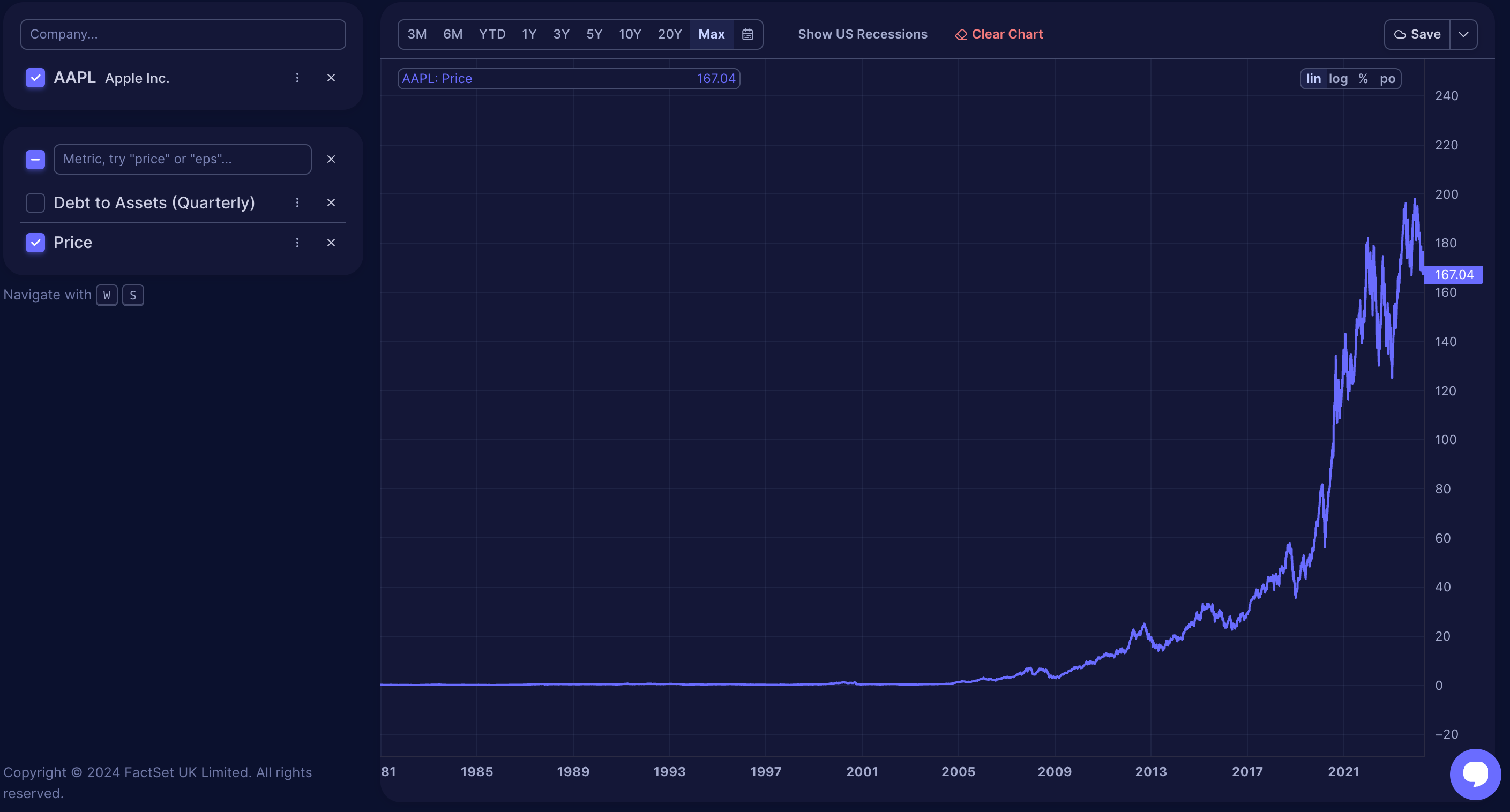
A good rule of thumb is to use the linear scale for metrics that are expressed as percentages, such as profit margins, growth rates, or potential gains
Logarithmic scale (log)
Check out the same Apple stock price data, but this time on a logarithmic scale.
This scale, also known as a geometric scale, presents data as percentage changes rather than absolute changes. With logarithmic scaling, each interval on the chart is multiplied by the logarithm's base, offering a clearer visual representation of percentage fluctuations over time and helping you better grasp the chart's trends.
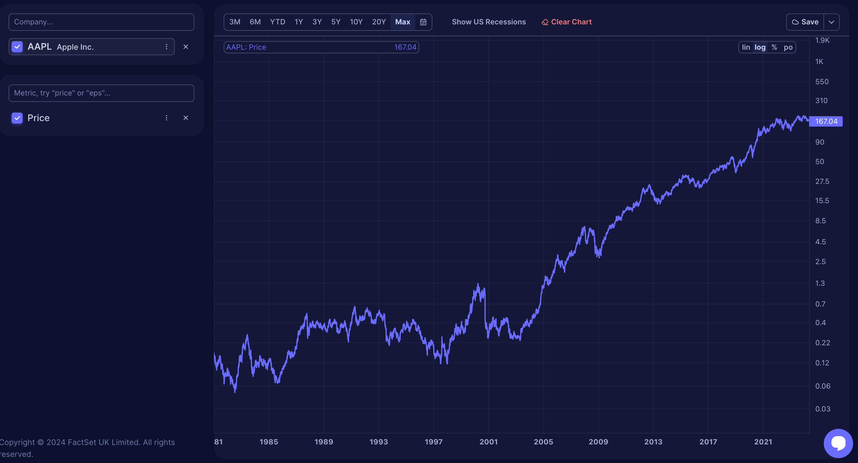
Metrics such as stock price, revenues, EPS, cash, debt, and price targets are best displayed on a logarithmic scale. This scale effectively represents non-percentage values by emphasizing percentage changes, making trends clearer. Use a logarithmic scale unless you have a specific reason for a different choice.
Percentage scale (%)
The percentage scale is ideal for comparing metrics across different companies. For instance, it clarifies growth rates by showing percentages rather than absolute numbers, making comparing companies of different sizes easier. For example, comparing Apple’s revenue growth from $260 billion to $394 billion against Zoom’s growth from $0.5 billion to $4.35 billion becomes straightforward on a percentage scale, revealing which company's sales increased more proportionally.
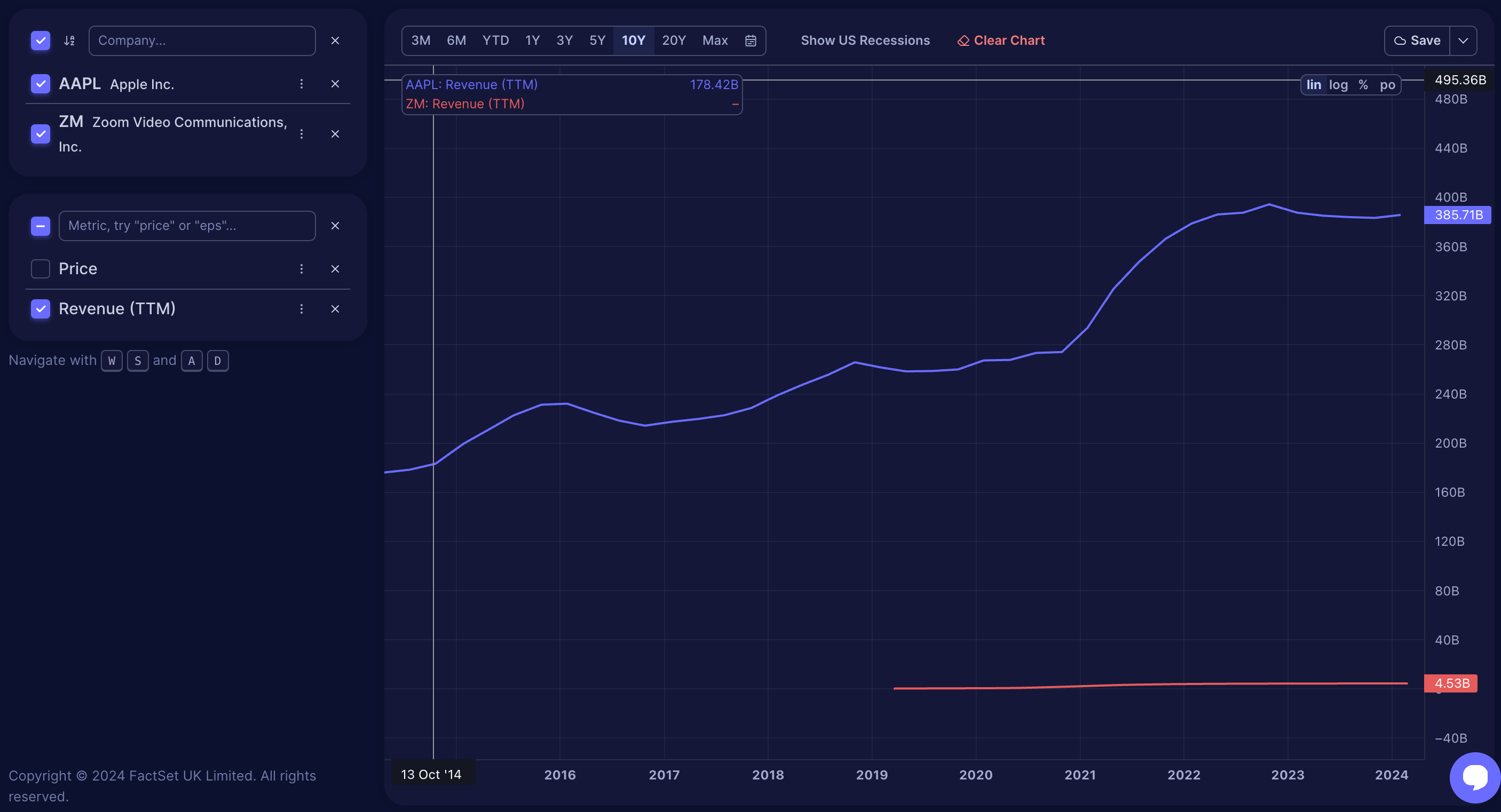
Always use the percentage scale for comparisons between non-percentage metrics or different companies. It is particularly valuable for comparing growth rates, such as stock price increases versus EPS or revisions in revenue estimates. This scale helps determine if stock prices have already adjusted to positive forecast revisions, showing whether the price increase reflects the expected growth.
Percent off high scale (po)
The 'Percent off high' scale displays how much a metric, like a stock price, has fallen from its recent peak, shown as a percentage. For instance, a 25% reading indicates the stock has dropped 25% from its high. This scale is useful for assessing potential lows during market corrections and comparing the extent of stock price falls with price targets or forecasts reductions. It helps evaluate whether a negative analyst revision is proportional to the stock’s price decline.
Occasionally, you might want to explore views of different scales to understand the data better. You can switch between the various scales by clicking on the scale options, but it's important to be familiar with what each scale represents and how it affects the data display.