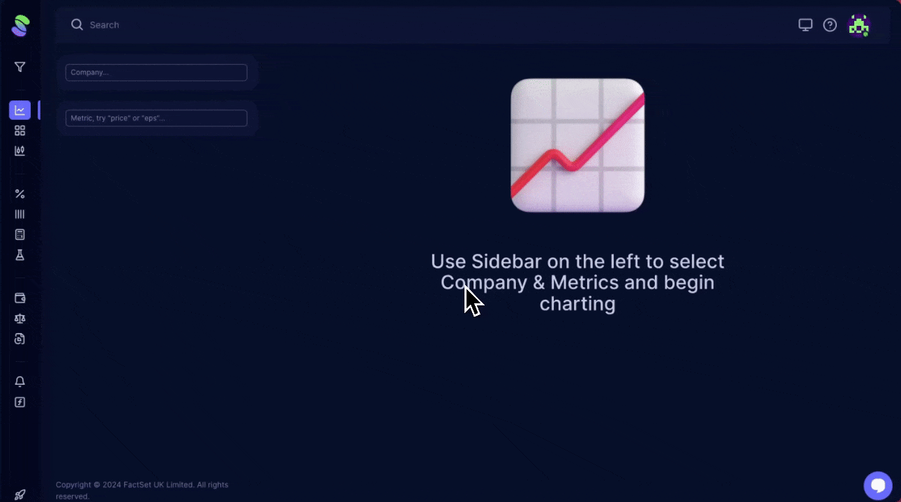
To start using the Master Chart, navigate to the Chart Category in the left navigation Panel. When ready, pick the company and the specific data metric you want to explore:
- Selecting the Company: In the search box, type the first few letters of the company's name or stock ticker symbol.
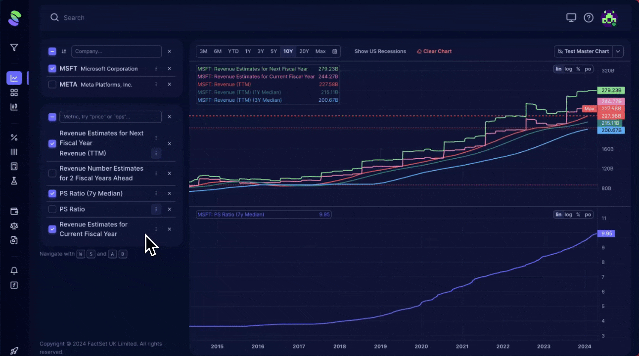
- Choosing the Metric requires knowing which financial data you want to view. Common metrics our users check include Revenues (both historical and forecasts), Earnings Per Share (EPS), various profitability margins (like Operating Margin), cash flow metrics, returns (such as Return on Assets), valuation ratios (like P/E and P/S), and future growth indicators (like Price Targets and Upside).
With these details set, the Master Chart will visualize the selected data for you, providing a clear graphical representation of the financial metrics you are interested in.
Master Chart Functionality
Master Chart provides you with:
1. Time Frame Customization:
- Quick Selection: Easily switch between predefined time periods such as six months, Year to Date (YTD), or up to 20 years.
- Custom Range: Use the calendar icon to set specific start and end dates.
- Additional Features: Access more options like showing US recession periods or resetting all settings via their respective buttons.
2. Saving and Loading Pre-Saved Charts:
- Save Your Setup: You can save your chart settings to the cloud for easy access later, so you don't need to redo your setup.
3. Adjusting Chart Scale:
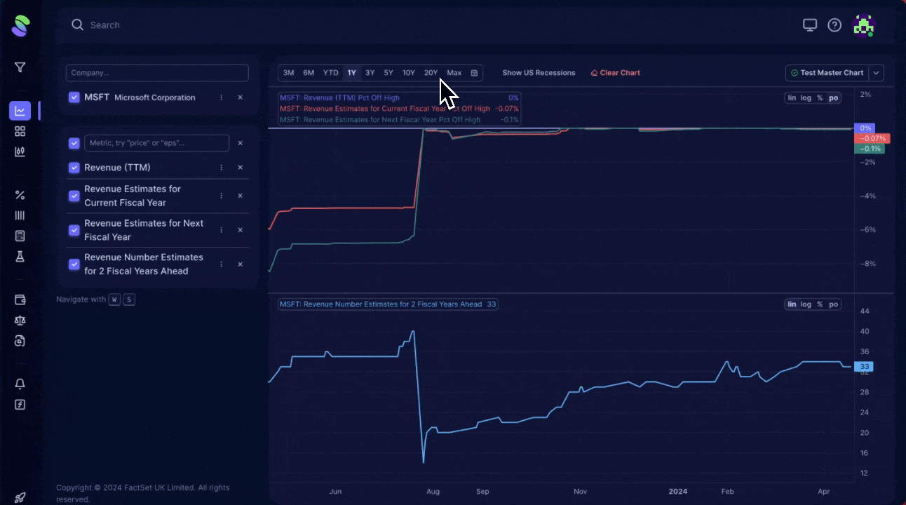
- Scale Options: Choose from linear (best for percentage data like margins or ratios), logarithmic (for absolute numbers like prices in dollars), percentage (for comparing the same metric across companies), or percent off high (to evaluate drawdowns from peak values).
- Why It Matters: Picking the right scale helps accurately interpret data, avoiding misreadings due to scale distortions.
4. Enhancing Data Visualization:
- Add Data Layers: Introduce additional data series, such as moving averages or median lines, to get a clearer picture of trends and comparisons.
- Contextual Comparison: Use tools to compare metrics like debt levels against industry averages to assess if a figure is typically high or low.
Navigating Multiple Metrics
When multiple metrics are added simultaneously, the chart becomes challenging to analyze because of the chaos caused by overlapping data.
Master chart gives you:
- Simplify Viewing: Manage complexity by grouping related metrics together, allowing for contextual analysis like comparing revenue forecasts for different years.
- To 'Group' similar metrics, simply drag and drop them together. To ungroup, drag the metric 'out' of the group.
- Interactive Features: Toggle metrics on or off to focus on relevant data without overcrowding the chart.
For even faster navigation, use the 'W' and 'S' keys to switch between metrics or the 'A' and 'D' keys to cycle through different companies if multiple are added. This setup allows quick and efficient comparison across different data points and companies.
These features are designed to make financial analysis more intuitive and tailored, helping you make informed decisions based on comprehensive data visualizations.