To optimize your scoring model, you can choose from 5 rule types: Static Range, Historical Range, Metrics Comparison, Change Over Time, and Max Decline.
Each rule provides our algorithms with a specific guideline on how to evaluate a particular metric or scenario:
- Static Range: Define static thresholds for metrics to identify performance highs/lows from a specified range.
- Historical Range: Utilize historical data to set dynamic performance ranges for each stock.
- Metrics Comparison: Compare two distinct metrics to create custom indicators.
- Change Over Time: Assess the percentage change of a metric over a specified period to gauge performance.
- Max Decline: Track declines from a metric's peak to understand downward trends.
Read on to understand the differences between each rule and how to use each rule type in your scoring models.
Static Range
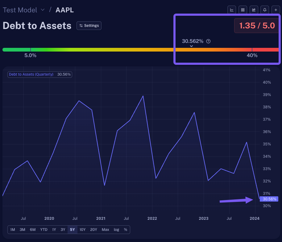
Use the' Static Range' option to check if a metric's readings are high or low within a certain fixed range you’ve defined.
This is perfect for metrics that generally stay the same across most companies, like Debt-to-Assets or Current Ratio. Whether it's Apple or Ford, a 70% debt level signals trouble, while 0% suggests financial stability. The specific range you set for 'high' or 'low' might vary, but it typically remains consistent, not fluctuating much over time.
Practical Application:
Say you want to determine if a company's debt level is high or low and define a static range of 40-5%. This will mean that every company with a Debt-to-Assets ratio higher than 40% will be considered 'bad' and scored with 0 points. Alternatively, every company with a lower than 5% debt will be rewarded the maximum points available and deemed 'good.'
In the figure below, using the Static Range rule type and grading scale mentioned (40-5%), AAPL would be considered ‘bad’ since their Debt to Asset ratio is 30.562, close to 40%.
Due to this, Scrab has given this metric a very low score of 1.35 out of 5.
Historical Range
Unlike the static range, this rule adjusts to each stock uniquely by automatically calculating whether a company's stock price or financial health is good or not so good compared to its history. It's ideal for metrics like P/S, EV/EBITDA, or Upside, where value greatly varies across companies and industries due to growth prospects.
It’s important to remember that not all companies' values are measured similarly. Companies expecting to grow quickly might have higher values in their stock prices or earnings forecasts. If we used the same rule to measure all companies, it wouldn't work because each company's situation is different. That's why we look at each company's own history to set up rules that fit just right. This means that sometimes, a company with big growth potential might need to show an even bigger promise before we decide it's a good investment.
Practical Application:
A simple ranking by upside percentage might seem straightforward when assessing companies to invest in based on their potential price increase (upside), but it is not always effective.
High-quality companies may not show a large upside, making them less likely to be selected if only a high upside is considered. Different companies require separate upside thresholds to be considered a good investment, reflecting their risk level, growth prospects, and financial stability.
Consider Companies A, B, and C; within a historical range of 5 years, all have a current upside of 20%:
- Company A’s upside historical range is 0-25%
- Company B’s upside historical range is 5-40%
- Company C’s upside historical range is 20-80%
Based on the historical context for each company, most investors may not consider Company C until the upside is at 70-80% to justify the risk, as 20% is the lowest in that historical range. Others may consider Company B until the upside is at least 30-40% since it’s not great but not bad. Company A would be the stock every investor would consider buying quickly before other investors buy and drive up the stock price as it is closest to the highest upside within the 5-year span.
We can adjust our picks based on each company's unique history by checking how they've done before to predict their future, knowing that not all will perform the same.
Metrics Comparison
This rule type is ideal for contrasting current values against historical averages, such as comparing a company's current P/S ratio to its five-year median. This method enables you to create unique indicators by differentiating two distinct metrics and assess investment potential without relying on static or dynamic ranges.
Practical Application:
You might evaluate companies by comparing their forecasted EPS growth for the next year against last year's EPS, setting specific thresholds to define the minimum acceptable growth. This strategy provides nuanced insights by awarding points based on how closely companies meet these personalized benchmarks.
For example, you could look at each company's EPS Estimates for the Next Fiscal Year vs. EPS Annual or TTM, and your custom 'Good to Bad' thresholds are set from 10% to 20%. Anything equal to or closer to 10% would be considered 'bad,' while an EPS closer to 20% would be scored as 'good.' Any reading in between will receive some points, but neither all nor none.
Change Over Time
This rule evaluates a metric's percentage growth or decline over time, comparing companies of various sizes fairly. It shifts focus from absolute values to percentage changes, making it ideal for assessing metrics like revenue growth, EPS, cash flow, or adjustments in financial forecasts and price targets. For instance, while a $10 million increase in revenue might be a big thing for smaller companies, it's pocket change for industry giants like Apple, highlighting the necessity of percentage-based evaluations that will fairly represent the scale of each company.
Practical Application:
Let's say you want to assess a company's growth through dividend payouts. You'd most likely consider using the 'Total Dividends Paid' metric with a dynamic range based on historical performance. For example, setting a rule that checks if the dividend growth over the last five years is at least 20% can help you differentiate between companies. This method ensures that those consistently increasing their dividends score higher, with thresholds set to distinguish between lower (20%) and higher (30%) growth, allowing for a nuanced evaluation in your scoring model.
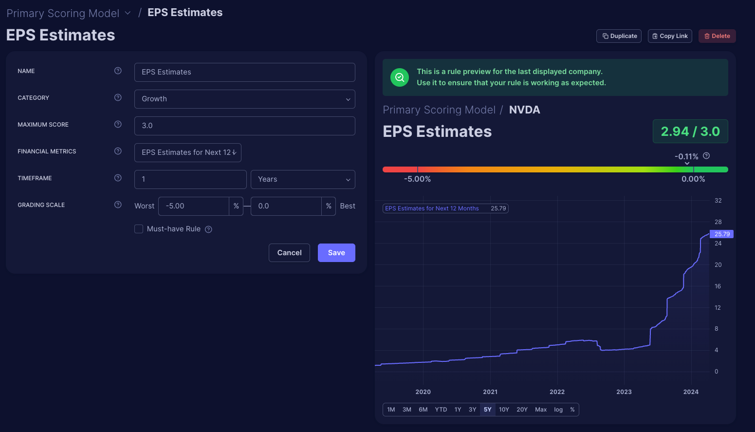
Max Decline
The 'Max Decline' rule specifically measures the decrease of a metric from its highest point to find the percentage of decline. Unlike general change tracking, which includes growth, this rule focuses solely on downturns in metrics such as stock price or EPS estimates. This rule gives you a precise way to evaluate decline without the visual bias of charts, which might misrepresent minor decreases as significant due to scaling issues. This way, you ensure an objective analysis based on pure numerical data, eliminating potential visual misinterpretation.
Practical Application:
Let's take EPS estimates' revisions and use the 'Max Decline' rule to identify changes quickly. We can detect analysts' forecast adjustments by setting a rule to check if the EPS estimate for the next 12 months has declined over the last 30 days. Negative revisions suggest caution but not necessarily trouble if growth is still expected, just slower. We can apply a grading scale from -5% to 0%, where significant drops lead to lower scores, and increases can boost a company's score, allowing a more balanced assessment rather than a binary good/bad judgment.